If you could see the web, what would it look like? I was recently asked, “What does the web look like?” This inspired me to find out what it might look like if we could see the web and Internet, all the interconnected parts and pieces that create the spider web for which the “web” got its name. Using this powerful medium, I researched for visual images and generators of the web, or more specifically, web content and how the web is visually displayed – or if there is a way to really see what the web looks like.
 The first place to start a search for what the web looks like is with search engines, since they are the tie that binds the Internet together. Their spiders and web crawlers dig through websites and input the data they find into huge databases which users can then search through. The search results they create make links to web pages, but search engines like Google use page ranking algorithms to determine the value of a site, and much of that score card is filled with points based upon how many links connect one page to others, thus fleshing out the web strands.
Visual images of how Google connects the dots on the web are plenty. Search Engine Watch’s “Visualizing the Web with Google” discusses the techniques and concepts of graphically displaying Google search results and connections with examples using Touch Graph Google Browser, Amazon Browser, and Google Set Vista. These give us the picture of how Google connects the strands of the web.
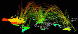
In the early days of the Internet and Web, many experts were determined to analysis the relationships of all the connections in the World Wide Web. The Internet Mapping Project started with great enthusiasm, creating some interesting maps of the web in their gallery. The OPTE Project is even more serious about their cybermaps of the web. The volunteer run organization is constantly monitoring and improving their programming to capture the relationships on the web visually to help us get a picture of what the Internet looks like.
This project was created to make a visual representation of a space that is very much one-dimensional, a metaphysical universe. The data represented and collected here serves a multitude of purposes: Modeling the Internet, analyzing wasted IP space, IP space distribution, detecting the result of natural disasters, weather, war, and aesthetics/art.
The OPTE Project
More scholarly work on mapping the Internet can be found at Visualizing the Structure of the World Wide Web in 3D Hyperbolic Space, Jevans – Mapping the Internet, ARPANET Psiber SPACE (circa 1986). Unfortunately, many of the links to these older research papers to visually map the Internet came up dead as many students and doctoral candidates start these projects and then lose interest as their interest and scholarly studies take them elsewhere.
 As the popularity of the web increases, artists are getting into the thrill of mapping the Internet, creating visual representations of the web and Internet, often exceeding the potential of mathematical visual images of the web.
Cyberatlas Guggenheim showcases a wide variety of artist works representing the web, though most of it is heavily done in Flash. There are over a dozen different artist renderings of what the Internet might look like, filled with colorful graphics, charts, lines, and artistic designs. Omnizone is another gallery project of artists trying to map the unmappable. Omnizone presents graphical representations of the web, but their web pages take over your whole browser. Luckily, some of the work is also showcased on the Guggenheim site.
 Cybergeography is the science of styling cyberspace and their website is stuffed with a lot of information to help you visualize the web, including using visualizing traceroutes, geographic visualizations of the web, maps of Internet Providers, and website maps. The project is part hobby part research project collecting and documenting all the different ways the web is portrayed – giving us a collection of visual images of the web.
 In a very unusual graphic representation of the web pages’ popularity and relationships with that popularity, Vox Delicii highlights popular blog posts with an interactive artistic bar graph, giving you a visual view on post popularity and relationships. Move your mouse over the various widths in the “chart” to see the names of the posts. Their titles are displayed above the chart and below. Highlight a popular post on one day and its popularity “bar” on another day is highlighted, showing you the growth of the post’s popularity. Click on a post’s bar and the chart moves around to isolate that posts “bars” across the days of the week. Fascinating to play around with. This could be a visual method of viewing popular posts that might have changed how we find interesting content, but unfortunately, the project didn’t last.
Hublog’s Graph del.icio.us related tags gives another similar view of relationships between web content by displaying relationships between delicio.us tags. It lets you enter some tag names to see all the ways different tags are related to one another in del.icio.us. The author went even further to explore the Graph del.icio.us subscriptions network to see how different subscribers were graphically linked together. I also found similar graphs for Technorati TouchGraph. There are also graphs of relationships with Amazon and Wikis.
 Web Brain is another graphical keyword search engine that shows the words relationships with related words and synonyms. It’s fast and easy to understand interface could make this become a popular visual search engine.
As the web becomes more peer-to-peer dependent and social capital gains more and more power over how we find, promote, and share interesting content, these visual graphs, charts, and images could be of value to help us see the relationships within the web in new ways.
I’d love to see some visual graphics representing the interconnectedness of WordPress.com and WordPress users, but for now, you can look at the relationships between users of LiveJournal with the TouchGraph LiveJournal Browser.
 As we imagine the web, we often think of the largest parts and pieces and how they are interconnected, but your own blog or website is also a smaller web which has its own unique look and style. Five years of plasticbag.org: The Visualisations explored five years of posts and created visual images of that site’s relationships and connections, then created three more sets of blog visualizations as the site owner played with the many possibilities and perspective with some creative folks. I wonder what your blog would look like using some of these techniques?
Why not experiment with what your blog would look like if you could map out and draw the web around it? You can. You can map your own cyberspace with a traceroute or ping. You can trace the time it takes, and even the visual picture, of how long it takes for your IP address to link to another. Some free traceroute tools include Traceroute, Princeton Traceroute Tool, Using the Traceroute Tool, Caida Geographic Trace (GTrace), Caida MapNet, Global Web Explorer, Zooknic, NW Tools – Traceroute, Webmaster Toolkit – Ping, InternetIPAddress – Ping, Just Ping, and Tracert Traceroute Gateway.
As the web is growing daily, I know there will be more and more attempts to visualize the web. As the ability to compute sophisticated calculations increases along with digital imaging, I expect even more dramatic visual representations that will help us see what the web looks like.
Here are a few more resources to help you understand more about visualizing the web and all its interconnectedness, maybe helping you answer the question: “What does the web look like?”
- Visualizing the Collective Brain
- Visual Settlements – First Implementation
- What’s a BlogScape?
- Visualizing and Discovering Web Navigational Patterns (pdf)
Have you found any good visual representations of the Internet?

Site Search Tags: visualize the web, what does the web look like, what does the internet look like, cybermaps, cyber map, traceroute, map your blog, world wide web, web maps, web graphics, internet maps, internet graphics, picture of the web, web pictures, internet pictures, graphics, images, charts, graphs, web statistics
 Subscribe
  Via Feedburner
  Subscribe by Email
  Visit
Visit
Copyright Lorelle VanFossen, the author of Blogging Tips, What Bloggers Won't Tell You About Blogging.


11 Trackbacks/Pingbacks
[…] Lorelle on WordPress » Can You Visualize the Web? (tags: maps Web blog) […]
[…] Can You Visualize the Web? […]
[…] Lorelle on WordPress » Can You Visualize the Web? (tags: internet links map) […]
[…] Among the various articles I wrote, “Can You Visualize the Web?” was a favorite. My mother asked me what the Internet was and what it looked like. It’s easy to explain that it looks like a spider web, with all the links interconnected together, but that didn’t satisfy her. I realized a lot of people didn’t know what the Internet looked like, nor honestly did I. So I went looking and I found a bunch of people trying to showcase the shape of the Internet and web. Fascinating. […]
[…] One of the articles I had the most fun researching and writing was “Can You Visualize the Web?”, inspired by my mother, a woman who sees the world through a different lens than most of us, who asked “What does the Internet look like?” Describing it as a “web” just wasn’t enough of an answer for her. […]
[…] I wrote Can You Visualize the Web? after searching for others who wanted to “see” what the web looked like, and the […]
[…] Can You Visualize the Web?: When my mother asked, “What does the web look like?” I was inspired. I dug around and did a lot of research, of which there wasn’t much available at the time, to find out what would the web look like if someone could paint, draw, or take a picture of the Internet. After all, we call it the “web” so would it look like a web? I was surprised and delighted at all the various artistic renderings, mathematical equations, charts, graphs, and creative ways people had to show us what the web would look like if we could see it. One of my favorite discoveries was Atlas of Cyberspaces, which was discontinued by the author last year but continues to have some of the most powerful visual images of all types of what the web would look like. The Cyberatlas Guggenheim, a lovely Flash exhibition of artist renderings of what the Internet looks like, still offers some of the most dramatic visualizations of what the web might look like if we could see it. […]
[…] Have you ever wondered what the Internet, WWW or an individual blog looked like? Having young kids and an interest in visualization — particularly 3D — gets you into these things! […]
[…] 2005, I asked “Can You Visualize the Web?” What would it look like if you could see the web. Many of those images match these early […]
[…] Can You Visualize the Web? […]
[…] Can You Visualize the Web? […]